Past Sites, Past Lives
I’ve been working on revising my website since the end of December 2019 (and is the reason I made wanderer). I did this mostly because I had a large amount of time and no other projects with me that I could work on, and somehow spiraled into something much larger, as usual.
= A personal site always feels like a monumental task; it’s meant to be an expression of the self, yet also a way to show off some part of that self to others. For me, it involves my creative and technical work; from the very first implementation of my site in middle school to the version that exists now, I’ve always had pages for showcasing my art, my games, the various websites I somehow formed.
I’ve made my personal website a lot of times over the years. I’ve made even more designs that didn’t quite make it to the implementation stage. A friend goaded me into looking through all my old archives again, and I saw for myself all the versions of the site from as far as 10 years ago.
And so, I thought it’d be good to document all the iterations of my site. From the version that exists at time of writing, aaaall the way back to…well, as far as I have files on my hard drive.
In chronological order, so we’re starting from the very beginning:
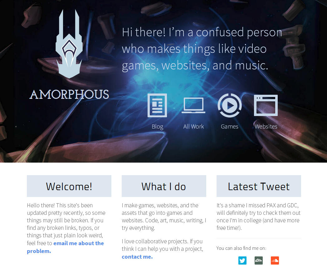
Crystalline V1
I started wanting a personal website far before I knew how to make websites (that weren’t just text and tables), no doubt from the influence of all the cool designer websites I kept finding.
But I did know how to use Photoshop (a bit), and so I came up with the coolest design I could think of:
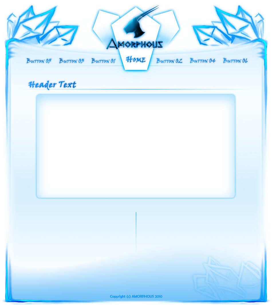
which…okay. 2010 was ten years ago. I was in high school. I don’t have any idea what I wanted to put on the site, since I apparently never put proper button labels, nor any body content, but I knew this much:
- I liked the name
Amorphouseven in 2010 - I really liked blue crystals
…both of which are still true!
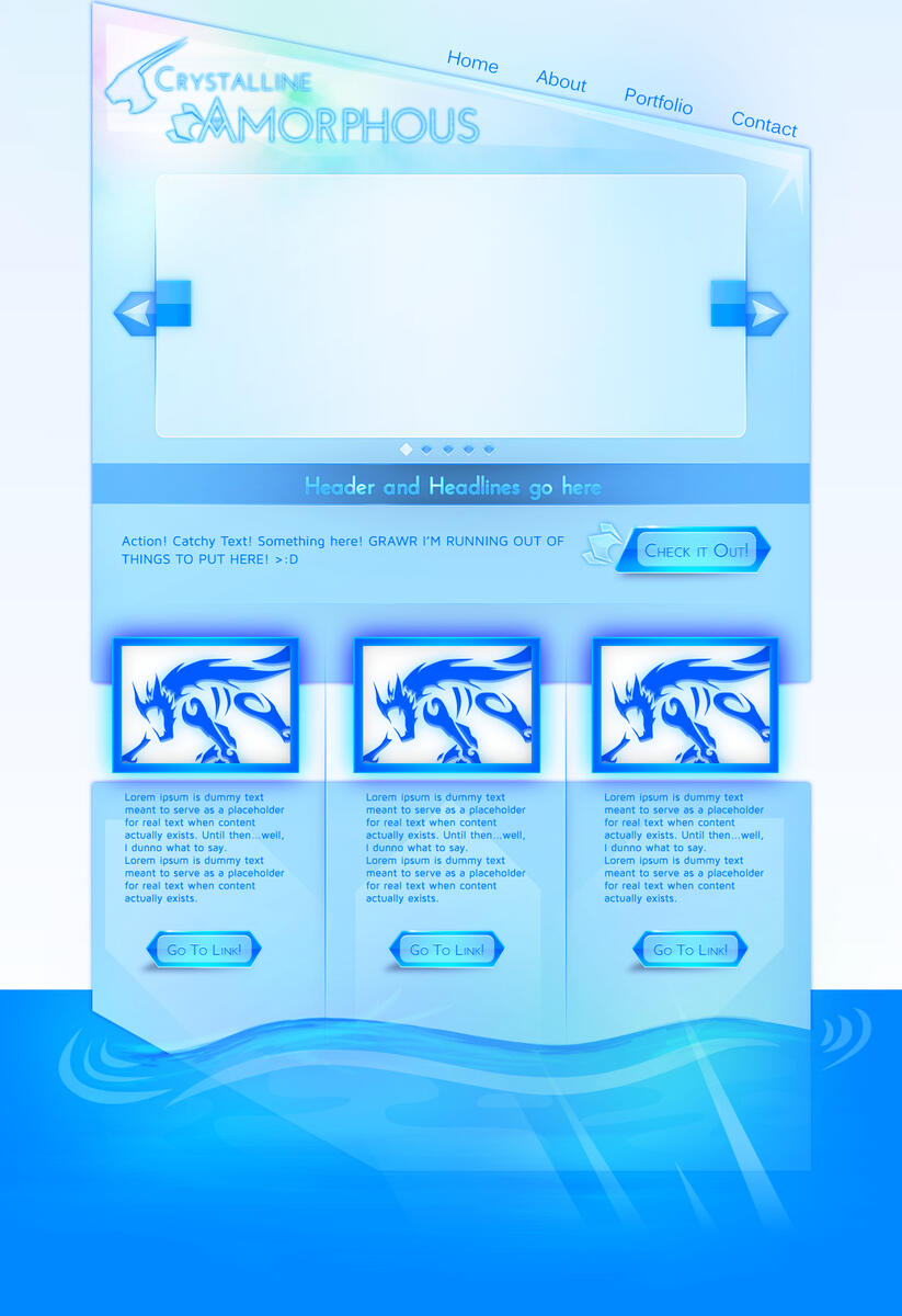
Crystalline v2
I don’t remember why I decided to redesign my site before even building it, but I do know that I made the v2 Crystalline before learning any more about web development. So it was still a Photoshop file, without any consideration as to how the HTML or CSS could look.
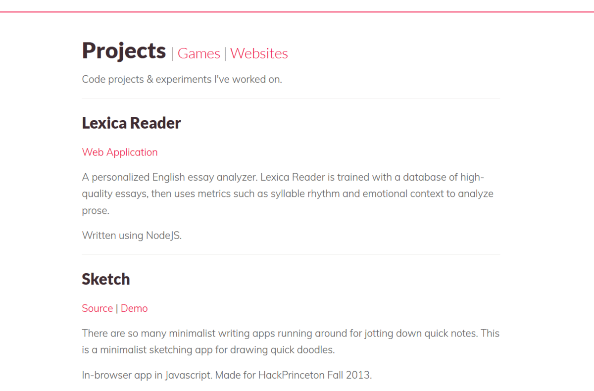
Crystalline v5
I’m not sure what happened to v3 and v4 either. But v5 was notable in that, by this point, I had learned some basics of putting together a website. And so rather than being a Photoshop mockup, this version of the site was actually live.
Unfortunately, the only page I could get operating was the designs page:
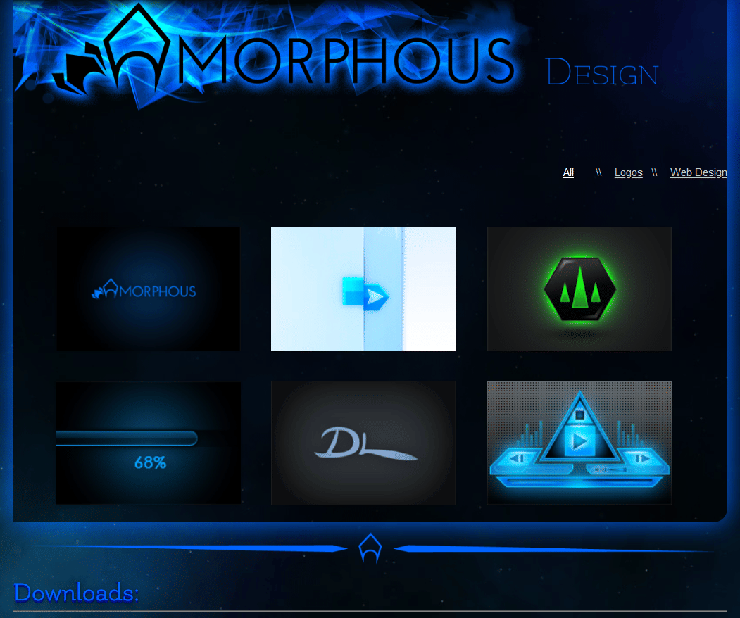
This was the era of jQuery and the very beginnings of CSS grids; I used the 1140px grid (now defunct), I was using media queries and Google webfonts (specifically, Flamenco, Josefin Sans, and Podkova), and slideshows and image galleries all over the place.
I also didn’t quite know the difference between HTML and PHP, because there’s PHP tags all over the HTML files.
Crystalline v6
If there’s anything that I was good at doing as a teenager, it was making a gazillion versions of the same thing. It was how I made artwork, how I made music, and apparently how I made websites.
v6 was where I started trying to make my site more ‘serious’. I transitioned from using HTML / CSS to Wordpress, and made the site more businesslike - I added a featured projects slideshow, had a blog, used screenshots for smaller projects, the works. I unfortunately don’t have that old old version of Wordpress anymore, so I can’t show a screenshot.
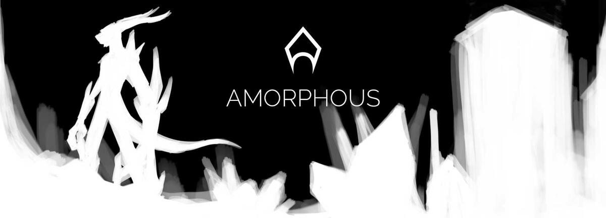
But I do have the fantastic 404 image that I made for it:
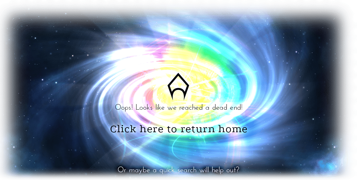
I think of everything I showed thus far, this was the piece that made me go ‘yep, this is definitely mine‘. Rainbow galaxy space background, with that crystal-A logo that I’ve been using for as long as I remember.
Beast Amorphous
I realize that I must’ve gone through approximately six designs in around 3 years, because I definitely remember creating this site also in high school.
This was after I’d launched a game (to very modest success), and wanted a more ‘professional’ online presence. So I tore down Crystalline v6, and decided to make another site in Wordpress to meet that goal.
This is what came out of it:
I think this is the first time I made a website and gave it a solid color background.
Looking back, I find this version of the site both impressive and a little remorseful. I learned a lot about web design and Wordpress making it, but I also know that it was starting around that time that I began to feel really pressured to be a certain kind of person - to be professional and ‘correct’ in how I presented myself online or otherwise. It’s a mindset that plagued me a lot through college, and I wound up suppressing a lot of my own design / artistic aesthetic. And I don’t think my fears were unfounded; in college, the sole motivation for a lot of this ‘showing off’ work was to get a job. Everything had to look the part.
This design, as well as the design that came after, is one of many examples of that, I feel. I never noticed it at the time, but I really was quite self-conscious of my creative work: both my art (including web designs), as well as my writing. (I like writing very long stories about queer people all making complex plans and having those plans fall to pieces. I did not write those kinds of stories throughout college.)
I really like adding space backgrounds to my websites. I did not for the rest of high school, or all of college.
Github Pages Site
After going to college, I managed to horribly break Wordpress, so I completely redid the site again. And, notably, decided to forgo using Amorphous as my name.
I think I said what I wanted to in the previous section. I made this entire site for the sake of impressing employers. I have no idea if it did that, or if anyone looked at it - to this day, I don’t actually know what ‘professional’ even means in terms of personal sites.
Also, despite the long list of very blue websites, that subtly pinkish red is actually my favorite color. But it doesn’t go very well with space backgrounds, which is why I don’t think I used it before this one.
Amorphic Space
Also starting with college, I was finally able to buy my own domain name without going through my parents. This was around the time where suddenly it was ‘okay’ to get a domain name that wasn’t .com, and so I was able to pick up amorphic.space relatively easily.
And this name was a little too obviously related to the Amorphous name I’d always used, so it was time to build yet another website using that identity again.
This version of the site kept the white background, but I think I was starting to see the limits of only using web ‘best practices’. Notably, I added a very large header to it because I wanted to:
(also continuing my trend of crystals.)
I kept this version of the site running for around four years. It shifted backends a few times from Jekyll to Gatsby, but has remained consistent in styling and content.
College was very hectic, and then after college I got a full time job. Everyone seemed to be using Twitter and Facebook, and suddenly having a professional personal site didn’t look so important. I didn’t have as much time to maintain (or rewrite) a website.
And then suddenly I did.
Amorphic Space v2
This whole mess started because I was doing a routine webpage update, but Gatsby had fallen so out of date that it wouldn’t build.
At around the same time, I joined Merveilles, which had a large group of people talking about how they used their personal sites as journals, how they had their own methods of creating and maintaining that space that was so indelibly theirs. I also learned about the Indieweb, and got a little too deep into the world of personal blogs and feeds. It all appealed to me, so I thought I’d spend a weekend creating my own simple generator and revising my site.
I’m very good at turning my small projects into large projects.
And so, several weeks later…I have almost a full site. Which is also a bit of a journal now, as I try to document more of my process. But I’m also trying to resist a little the sheer pull of professionalism that influenced my last two sites, so I’m always thinking of ways to add back in some of the nonsense that had always been in my art. (Of course, without destroying accessibility or bloating filesize too much.)
This involved:
- Space backgrounds, of course.
- Sword dividers!
I’m still not sure how to add blue crystals back in, but I’ll probably have them at some point. Also, that rainbow galaxy still hasn’t left my mind, so maybe that will have to return, too.
…and that’s all. 10 years of Amorphous’s personal site history. I’m very glad that younger me was prudent enough to keep all those files, as embarrassed as I must’ve been by them. Though sadly, all of the Wordpress content has since been lost.
It was a lot of fun looking at my old designs, figuring out what it was that I wanted to express back then. I find that a lot of what I enjoyed back then are things I still enjoy. A lot of the (even questionable) design decisions came from a place that was undoubtedly mine.