I’ve been very busy with a variety of activities over the summer, including a heavy development cycle at my day job, as well as participating in a stage play. Thus, naturally, I decided it was a good idea to add more work onto my plate by making a font.
I’ve done some fontmaking before, but at a fairly casual level; Diffusion was made by editing someone else’s font creation code, and Beholden by freehand drawing and having the font program auto-generate outlines without any kind of cleaning up. This time, I wanted to create a font I could use for body text, which meant that it had to be readable at small sizes. Also, that I’d have to actually properly draw the outlines as vectors, rather than just freehanding things and letting things go.
I used the Design with Fontforge e-book as my guide, even though I wasn’t using Fontforge itself (I found it too difficult to work with) – and instead used Glyphs. Previously, I’d used Fontlab to make Beholden (well, the 30 day trial version) but decided now that I had access to a Macbook that Glyphs was worth trying, and I like the program a lot.
The process involved:
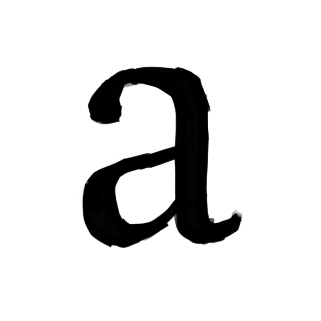
Drawing raw forms on an iPad with procreate for the basic glyphs (as described in the e-book, I started with ‘o’ and ‘n’, then moved on to the letters in ‘adhesion’.)
Transferring them to my computer, and using a vector program to convert them to outlines in svg format
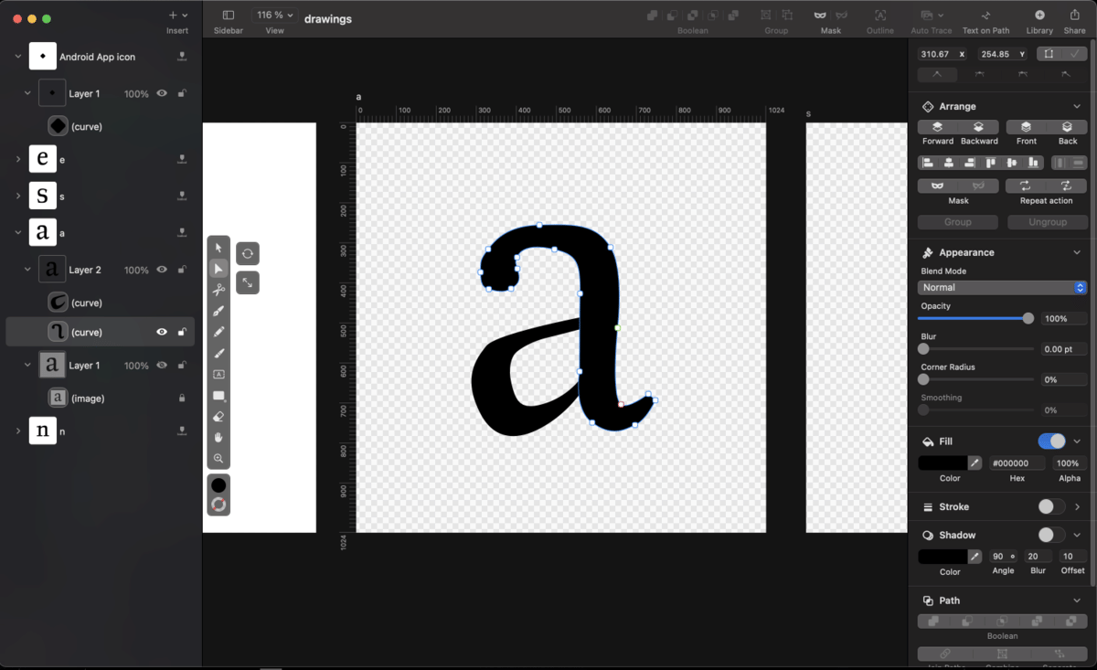
Importing the svg into glyphs and tweaking outlines until they looked right.
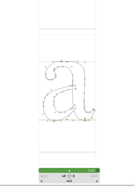
At some point I got comfortable enough with working in glyphs that I could forgo the other vector program step and draw directly in glyphs. Similarly, after drawing most of the lowercase and some of the uppercase, I found the remaining letters easy to infer from pieces already there (e.g. ‘F’ as an ‘E’ without the bottom leg) and so could skip the freehanding too.
In any case, this took a few weeks, and I have a font that’s mostly done. Mostly, because I don’t think I’ve gotten spacing totally right yet. But it’s serviceable, so I’m putting it to use now, on my own website. As of time of writing, the serif font I used for body copy has been switched over.
Please let me know if you see any errors! As it turns out, there are a lot of drawings in a font (and this still pales to anyone trying to create a Chinese-language font…), so there are probably details I missed. I’m using the font now, in part, in hopes of catching any mistakes I can find through its use.